

An original TeaLamp explainer based on the sources listed below. Prepared by the TeaLamp Editorial Team with the help of AI.
The golden ratio in art is one of the most repeated stories in culture: the idea that the Parthenon, the Mona Lisa and countless masterpieces were secretly built on a magic number close to 1.618, and that our eyes are wired to find it beautiful. It is a lovely story. The history, as mathematicians who have studied it point out, is far more modest, and in some ways more interesting.
Key takeaways on the golden ratio in art
- The golden ratio is a real and remarkable number, about 1.618, first described in geometry by Euclid more than 2,000 years ago.
- The names “divine proportion” and “golden section” are much later: the first comes from the Renaissance, the second from the 19th century.
- There is no good evidence that ancient builders or most famous Renaissance painters planned their works around it.
- Experiments on whether people prefer “golden” rectangles have given weak and mixed results.
- Some modern artists and architects really did use it on purpose, and it genuinely appears in how many plants grow.
What the golden ratio actually is
Take a line and cut it into a long piece and a short piece. If the whole line compared with the long piece is the same as the long piece compared with the short piece, you have cut it in the golden ratio. Written as a number, it is the positive solution of the equation x² = x + 1, which works out to about 1.6180339, a decimal that never ends or repeats. Mathematicians often call it phi.
The Greek geometer Euclid described this cut in his Elements, around 300 BCE, under the plain name “extreme and mean ratio”. He needed it to construct the regular pentagon and some of the regular solids, not to make anything look pretty. The number also has lovely habits. Its square is itself plus one, and the ratios between neighbouring numbers in the Fibonacci sequence (1, 1, 2, 3, 5, 8, 13, 21 and so on) get closer and closer to it. Leonardo of Pisa, known as Fibonacci, introduced that sequence to European readers in his Liber abbaci of 1202 through a puzzle about breeding rabbits.
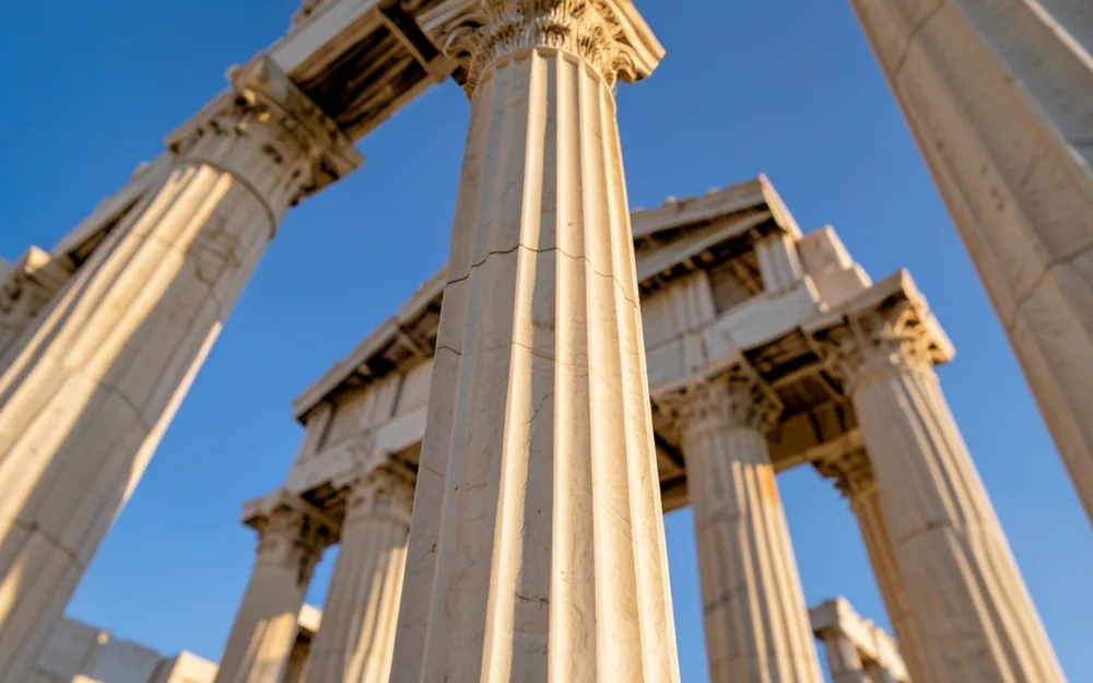
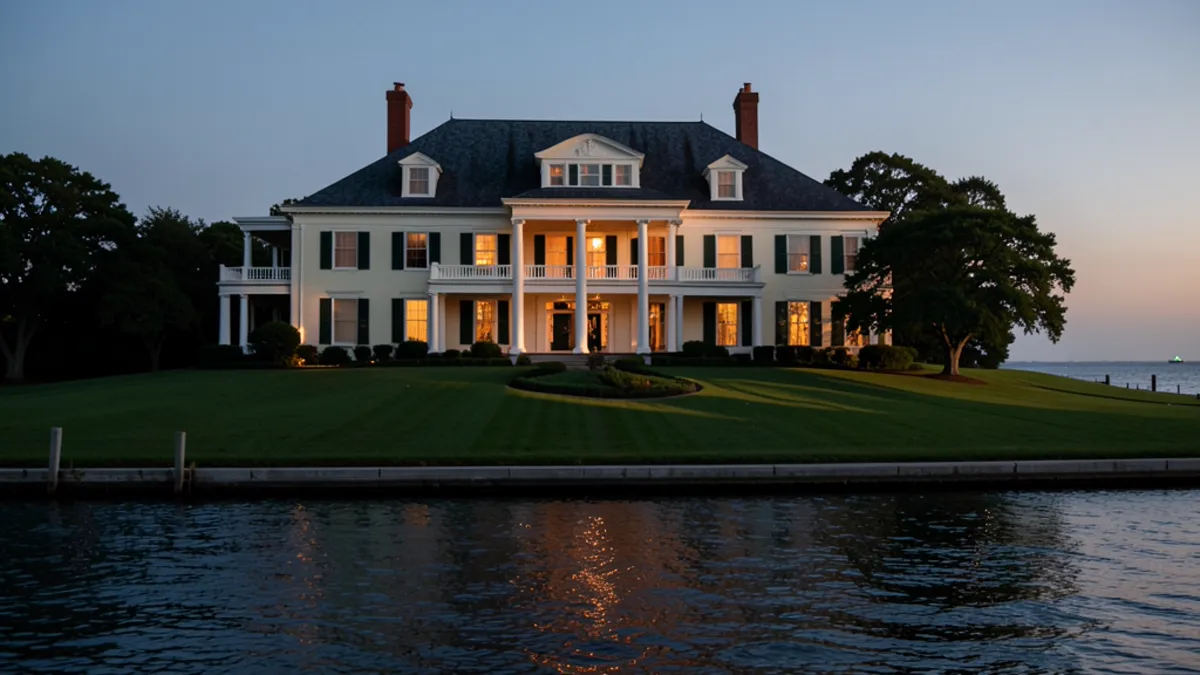
Claims that ancient temples follow the golden ratio rarely survive careful measurement. Image generated by AI.
How the name and the legend grew
For most of its history the number had no glamorous name at all. In 1509 the friar and mathematician Luca Pacioli published a book called De divina proportione, “On the Divine Proportion”, with drawings of geometric solids by his friend Leonardo da Vinci. Pacioli praised the ratio in religious and philosophical terms, but, as the mathematician Keith Devlin notes, he did not recommend it as a rule for making pictures.
The word “golden” seems to appear only in 1835, in a mathematics textbook by the German writer Martin Ohm. Twenty years later, in 1855, another German author, Adolf Zeising, argued that the golden section was a universal law found in the human body, in nature and in great art. Devlin and other historians trace the modern legend largely to Zeising. From there it spread through popular books, design guides and, much later, websites full of spirals laid over famous paintings.
Testing the famous claims
When the claims are checked, most of them fade. In a widely cited 1992 paper in the College Mathematics Journal, the mathematician George Markowsky looked at the usual examples, from the Great Pyramid to the Parthenon, and found that the measurements did not support them. The astrophysicist Mario Livio reached similar conclusions in his 2002 book The Golden Ratio.
The trouble is partly practical. Real buildings and paintings have many edges, columns, borders and figures, so if you are free to choose which points to measure, you can usually find something close to 1.6. Overlay diagrams online often draw thick lines, pick convenient starting points or quietly ignore parts that do not fit. A ratio of 1.5 or 1.7 can look “golden” in a picture, while the actual number is not. As Devlin puts it, there is no evidence that Leonardo, Botticelli or Seurat used the golden ratio when composing their works, however often the claim is repeated.
Do we really prefer golden rectangles?
In the 1870s the German psychologist Gustav Fechner showed people sets of rectangles and asked which they liked best. His results seemed to favour shapes near the golden ratio, and the finding was quoted for decades. Later researchers who repeated the tests, as reviews by the psychologist Christopher Green and by Chris McManus and colleagues describe, found the effect weak or unreliable: preferences changed with how the shapes were shown, what people were asked and who took part. Many people liked squarer or longer rectangles just as much. In short, there is no solid evidence that a single proportion is naturally the most beautiful to everyone.
Where artists truly used it
None of this means the golden ratio has no place in art. It has a real history, just a more recent one. In the 20th century some artists and architects chose it deliberately, often because they had read the 19th-century books. The Swiss-French architect Le Corbusier built his Modulor system of proportions, published in 1948, on the golden ratio and the measurements of an idealised human figure, and used it in his buildings.
Salvador Dalí is another clear case. According to the National Gallery of Art in Washington, his 1955 painting The Sacrament of the Last Supper measures about 167 by 267 centimetres, a ratio close to the golden one, and is set inside a large twelve-sided solid, a dodecahedron, the same kind of figure Euclid and Pacioli connected with the ratio. Dalí was influenced by the Romanian writer Matila Ghyka, whose books on golden geometry were popular with artists, and he used these proportions on purpose. So the best-documented golden-ratio paintings were made after the legend, partly because of it.
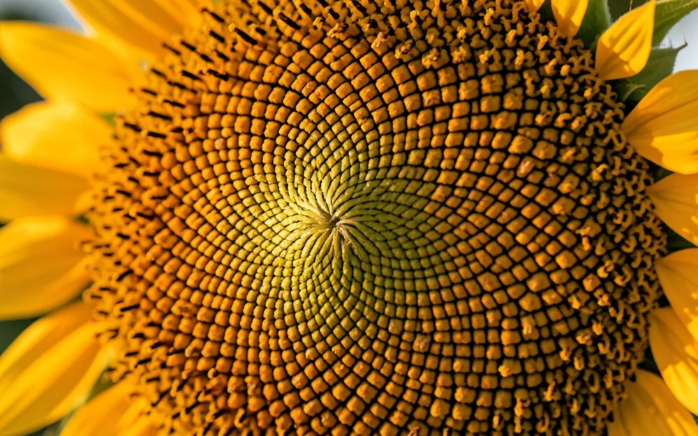
Sunflower seeds really do pack in spirals linked to the golden angle. Image generated by AI.
The place it really shows up: plants
If the art story is mostly myth, the plant story is mostly true. Many plants place new leaves, seeds or petals at an angle of about 137.5 degrees from the last one, the so-called golden angle linked to phi. Packing seeds this way leaves very few gaps, and it produces the crossing spiral patterns you can see in sunflower heads, pine cones and pineapples. Count the spirals and you often get neighbouring Fibonacci numbers, such as 34 and 55.
Not always, though. In 2016 a citizen-science project led by Jonathan Swinton and Erinma Ochu, published in Royal Society Open Science, counted spirals on 657 sunflowers grown by members of the public. Most counts were Fibonacci numbers or closely related to them, but nearly one in five was not. Nature leans strongly towards the pattern without obeying it perfectly. And the famous nautilus shell? Its spiral is beautiful but, as mathematicians have measured, not a golden one.
Why it matters
The golden ratio is worth knowing, both for its mathematics and for the history of how a geometry lesson became a myth about beauty. It reminds us to ask where a claim comes from and whether anyone has measured it carefully. It also gives credit where it is due. Great paintings work through many choices, such as light, colour, rhythm, story and skill, not a single secret number. Artists are free to use phi, and some have used it brilliantly. Others never needed it.
Related reading
For another look at what science can reveal about a famous artwork, read our piece on the science under the paint of Girl with a Pearl Earring.
Frequently asked questions
Is the golden ratio the same as the rule of thirds?
No. The rule of thirds divides a picture into three equal parts each way. The golden ratio would put the dividing lines a little closer to the centre, at about 38% and 62%.
Did Leonardo da Vinci use the golden ratio?
He drew the illustrations for Pacioli’s book on the divine proportion, but there is no good evidence that he planned his paintings around it.
Why does the myth last?
It is simple, it sounds scientific and it links mathematics with beauty. Pictures with spirals laid on top are also easy to share, even when the measurements do not fit.
Sources
- Keith Devlin, Mathematical Association of America: The Myth That Will Not Go Away (2007, archived)
- Keith Devlin, Devlin’s Angle: Fibonacci and golden ratio madness (2017)
- Mathematical Association of America: Fibonacci-based music that is not a Fibonacci folly
- Swinton, Ochu and others, Royal Society Open Science (2016): Novel Fibonacci and non-Fibonacci structure in the sunflower
- National Gallery of Art: Salvador Dalí, The Sacrament of the Last Supper (1955)
- Christopher D. Green, Perception (1995): All that glitters, a review of psychological research on the aesthetics of the golden section
- McManus, Cook and Hunt, Psychology of Aesthetics, Creativity, and the Arts (2010): Beyond the golden section and normative aesthetics
- George Markowsky, “Misconceptions about the Golden Ratio”, The College Mathematics Journal 23(1), 1992, pages 2–19.
- Mario Livio, The Golden Ratio: The Story of Phi, the World’s Most Astonishing Number (Broadway Books, 2002).







0 Comments